I Used The Web For A Day With Just A Keyboard
Chris Ashton
This article is part of a series in which I attempt to use the web under various constraints, representing a given demographic of user. I hope to raise the profile of difficulties faced by real people, which are avoidable if we design and develop in a way that is sympathetic to their needs. Last time, I used the web for a day without JavaScript. Today, I forced myself to navigate the web using just my keyboard.
Who Uses The Keyboard To Navigate?
Broadly, there are three types of keyboard users:
- Mobility-impaired users who struggle to use a mouse,
- Vision-impaired users who are unable to see clickable elements in the page,
- Power users who are able to use a mouse but find it quicker to use a keyboard.
How Many Users Are We Talking?
I’ve trawled the web for statistics on keyboard usage, and I couldn’t find a thing. Seriously. Not one study.
Most keyboard accessibility guidance sites simply take for granted that “many users” rely on keyboards to get around. Anyone trying to get an approximate number is usually preachily dismissed with “stats don’t matter — your site should be accessible, period.”
Yes, it is true that the scale of non-mouse usage is a moot point. If you can make a change that empowers even one user, it is a change worth making. But there are plenty of stats available around things like color blindness, browser usage, connection speeds and so on — why the caginess around keyboard statistics? If the numbers are as prevalent as sites seem to suggest, surely having them would enable a stronger business case and make defending keyboard accessibility to your stakeholders easier.
The closest thing to a number I can find is an article on PowerMapper, which suggests that 7% of working-age adults in the US, UK, and Canada have “severe dexterity difficulties.” This would make them “unlikely to use a mouse, and rely on the keyboard instead.”
Users with severe visual disabilities use software called a screen reader, which is software that reads out content on the screen as synthesized speech. Like sighted users, non-sighted users want to be able to scan pages for interesting information, so the screen reader has keyboard shortcuts for navigating via headings and links, and relies on keyboard focusable elements for interaction.
“People who are blind need full keyboard access. Period.”
— David Macdonald, co-editor of Using WAI ARIA in HTML5
These same users also have screen readers on their mobile devices, where they use swipe gestures instead of keyboard presses to ‘tab around’ content. So whilst they’re not literally using a keyboard, they do require the site to be keyboard-accessible as the screen reader technology hooks into the same tab ordering and event listeners as if they were using a keyboard. It’s worth noting that only about two-thirds to three-quarters of screen reader users are blind, meaning the rest might use a combination of screen-reader and magnification techniques.
2.3% of American people (of all ages) have a visual disability, not all of which would necessarily warrant the use of a screen reader. In 2016, Addy Osmani estimated actual screen reader usage to be around 1 to 2%. If we factor these users in with our mobility-impaired users and our power users, keyboard usage adds up to a sizeable percentage of the global audience. Therefore, caring about keyboard accessibility is not just doing the right thing morally (and legally — many countries require websites to be accessible by law), but it also makes good business sense.
With all of that in mind, what is the state of the web today? Time to find out!

The Experiment
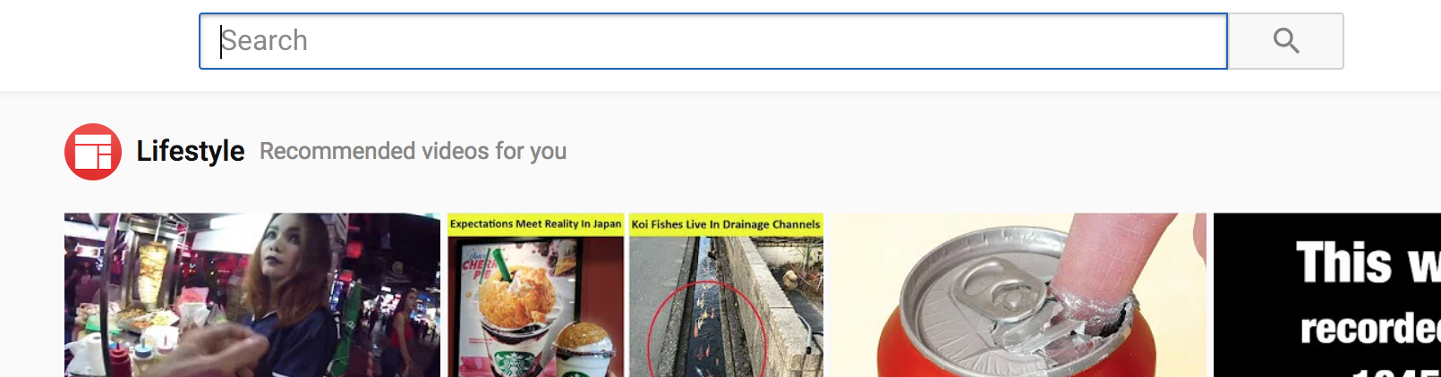
What does everyone do when they have a day’s worth of intimidating work ahead of them? Procrastinate! I headed over to youtube.com. I had a specific video in mind and was grateful to find I wouldn’t need to tab into the main search box, as it is focussed on page load by default.
The autofocus Attribute
I assumed this would be focussed with JavaScript on window load, but it’s actually handled by the browser with an autofocus attribute on the input element.
As a sighted keyboard user, I found this extremely useful. As a blind screen reader user, I’m not sure whether I’d like it or not. The consensus seems to be that judicious use of autofocus is OK, in cases where the sole purpose of the page is to interact with a form (e.g. Google landing page, or a site contact form).
Default Focus Styles
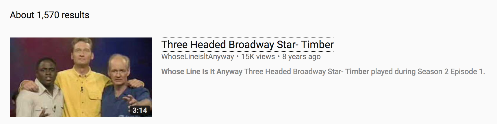
I searched for some Whose Line Is It Anyway? goodness, and couldn’t help noticing that YouTube hadn’t defined any custom :focus styles, instead relying on the browser’s native styling to visually indicate which elements I was tabbing through.

I’ve always been under the impression that not all browsers define their own :focus state, so you have to define your own custom styling. I decided to put this to the test and see which browsers neglect to implement a default style, but to my surprise, I couldn’t find one. Every browser I tested had its own native implementation of :focus, although each varied in style.


I even went quite far back in time:

If you’d like to see more, there is a comprehensive screenshot collection of different elements in browser native states.
What this tells me is that you can reasonably assume every browser comes with some basic :focus styling. It is OK to let the browser do the work. What you’re risking is inconsistency: all browsers style elements subtly differently, and some are so subtle that they’re not particularly visually accessible.
It is possible to disable the default browser focus styles — by setting outline: none on your element — but you should do this only if you implement your own styled alternative. Heydon Pickering recommends this approach, citing the unclear or ugly defaults used by some browsers. If you do decide to roll out your own styles, be sure to use more than just colour as a modifier: Add an outline or an underline or some other visual indicator to support users with color-blindness.
Many sites suppress default focus styles but fail to provide custom styles, leading to inaccessible experiences. If your site is using Eric Meyer’s CSS reset, it could be inaccessible; this commonly used file resets the default :focus styles but instructs the developer to write their own, and many fail to spot the instructions.
Some people argue that it can be confusing to the user if you disable the browser defaults, as they lose the visual affordance of the focus state they’re used to and instead have to learn what your site’s focus state looks like. On the other hand, some argue that the browser defaults are ugly, or even confusing to the non-keyboard user.
Why confusing? Well, check out this animated carousel format on the BBC. There are two navigation buttons — next, and previous — and it’s useful to the keyboard user that the focus remains on them throughout the narrative. But to the mouse user, it can be quite confusing that the clicked button is still ‘focussed’ after moving the cursor away.
The :focus-visible CSS Selector
If you want the best of both worlds, you may want to explore the CSS4 :focus-visible pseudo-class, which will let you provide different focus styling depending on context. :focus-visible styling only targets elements that have been focussed with keyboard, not with mouse click. This is super cool, though is currently only natively supported in Firefox. It can be enabled in Chrome by turning on the ‘Experimental Web Platform Features’ flag.

YouTube Videos And Keyboard Accessibility
YouTube does a great job with its video player — every part of the player is keyboard navigable. I like how the volume controls slide out when you tab focus away from the mute icon, in contrast to sliding out when hovering over the mute icon.

What I didn’t like was that helpful labels, such as the ‘Mute’ text that appears when hovering over the mute icon, don’t get shown on focus.
Another area that lets YouTube down is that it suppresses some focus styling. Here was me trying to tab to the ‘Show more’ button.

I accidentally tabbed right past the ‘Show more’ button because I couldn’t see any :focus styling applied, whether custom or native. I figured out that the native styling was being overridden with outline-width:

outline-width: 0 rule enabled the blue border native Chrome focus styling. (Large preview)GitHub Keyboard Accessibility
OK, work time. Where better to work than at the home of code, github.com?
I noticed three things about GitHub: One great, one reasonable, and one bad.
First, the good.
‘Skip To Content’ Link

GitHub offers a Skip to content link, which skips over the main menu.
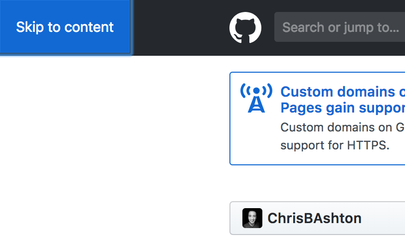
Skip to content link appears! (Large preview)If you hit ENTER while focussed on the ‘Skip to content’ link, you skip all of the menu items at the top of the page and can start to tab within the main area of content, saving time when navigating. This is a common accessibility pattern that is super useful for both keyboard and screen reader users. Around 30% of screen reader users will use a skip link if you provide one.
Alternatively, some sites choose to place the main content first in the reading order, above the navigation. This approach has fallen out of fashion as it breaks the guideline of making your DOM content match the visual order (unless your navigation visually appears at the bottom). And whilst this approach means we don’t need a ‘Skip navigation’ link at all, we’d probably want a ‘Skip to navigation’ link in its place.
Tab To See Content
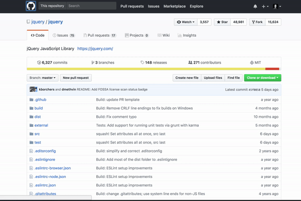
One feature I noticed working differently to the ‘non-keyboard’ version was the code breakdown indicator.
Using the mouse, you can click the colored bar underneath any repository to view a proportional breakdown of the different programming languages used in the repo. Using the keyboard, you can’t actually navigate to the colored bar, but the languages come into view automatically when you tab past the end of the meta information.

This doesn’t really seem necessary — I would happily tab to the colored bar and hit ENTER on that — but this different behavior doesn’t cause any harm either.
Invisible Links
One problematic thing I came across was that there was an “invisible” link after tabbing past my profile picture at the top right. My tab order would tab to the picture, then to this invisible link, and then to the ‘Watch’ button on the repo (see gif below). I had no idea what the invisible link did, so when I recognized I was on it, I hit ENTER and was promptly logged out!
On closer inspection, it looks like I’ve navigated to a “screenreader only” form (sr-only is a common screen reader class name) which has the ‘Sign out’ feature.

This sign-out link is in addition to the sign-out link on your profile dropdown menu:

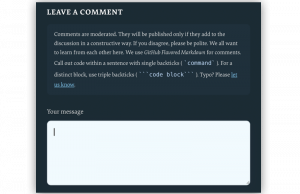
I’m not sure that two separate HTML sign-out links are necessary, as a screen reader user should be able to trigger the drop-down and navigate to the main sign-out link. And if we wanted to keep the separate link, I would recommend applying a :focus styling to the screen-reader content so that sighted users don’t accidentally trigger logging themselves out!

How To Make A ‘Skip To Content’ Shortcut
So how do we recreate that ‘Skip to content’ shortcut? It’s pretty simple to implement, but can be deceptively tricky to get perfect — so here is what I consider to be the Holy Grail of skip links solutions.
‘Skip link’ is alternatively called ‘Skip navigation’, ‘Skip main navigation’, ‘Skip navigation links’, or ‘Skip to main content’. ‘Skip to main content’ is probably the clearest as it tells you where you are navigating to, rather than what you are skipping over.
The shortcut link should ideally appear straight after the opening tag. It could appear later in the DOM, even after the footer, provided you have a tabindex="1" attribute to force it to become the first interactive element in the tab order. However, using tabindex with a number greater than zero is generally bad practice and will often result in a warning when using validation tools such as Lighthouse.
It’s not foolproof to rely on tabindex, as you may have more than one link with tabindex="1". In these cases, it is the first link that would get the tab focus first, not any later links. Read more about using the tabindex attribute here, but remember that you’re always better off physically moving your link to the beginning of the DOM to be safe.
Skip to main content
The ‘Skip to main content’ link has limited use to sighted users, who can already skip the navigation by using their eyes. So, whilst some sites keep the skip link visible at all times, the convention nowadays is to keep the link hidden until you tab into it, at which point it is in focus and gains the styling applied by the :focus pseudo selector.
.screen-reader-shortcut {
  position: absolute;
  top: -1000em;
}

.screen-reader-shortcut:focus {
  position: fixed;
  top: 0;
  left: 0;
  z-index: 999;
  /* ...and now any nice styling you want to apply... */
  padding: 1em;
  background-color: rgb(114, 105, 105);
  color: white;
  text-decoration: none;
}
So, what are we actually skipping to? What is #main-content? It can really be anything:
- Inline content
i.e. the id of yourh1tag: - Container
e.g. the id of the container around your main content such as. - Sibling anchor
You can link to a named tag just above your main content, e.g.. This approach is usually described in older tutorials — I wouldn’t recommend it these days.
For maximum compatibility across all screen readers, I’d recommend linking to the h1 tag. This is to ensure that the content gets read out as soon as you’ve used the skip link. Linking to containers can lead to funny behavior, e.g. the screen reader starting to read out all the content inside the container.
Your #main-content should also have a tabindex of -1, to ensure that it is programmatically focussable. Some screen readers may not obey the skip link otherwise.
This is the title of the page
One last consideration: legacy browser support. If you have enough users on IE9 or below, you may need to apply a small JavaScript fix to your skip links to ensure that the focus does actually shift as expected and your users successfully skip your navigation.
Why Are We Reinventing The Wheel?
It seems crazy that as web developers we have to implement this ‘skip navigation’ hack on all of our sites as a rule. You would think we could let the standards do the work.
Since HTML5, we’ve had semantic elements such as ,